Monday, March 28, 2011

Container as content

In my understanding of the statement " Container as content", I would interpret it as using the container itself to deliver the message to audience. Instead of letting the wall to be empty, it can be decorated or be transformed into something interesting with message for audience to read or see o even explore on. A very simple example is sticking posters on the wall or simply a wall mural. Below are a few wall "containers" being used as a content.

Transformed a wall into unusual shape, with seats and also embedded with screens.


Placing baskets on the wall and also posters.


Posters placed all over the wall.

A huge wall mural painted by an artist.

By using a container as a content, it brought out a new and different view of the thing than it originally was.


*Photos are taken from Google image.*


Thursday, March 24, 2011

Last week's belated post (2)

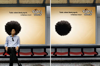
Since my previous post is about bus stops, I found few other bus stops' advertisements online and would like to share them here. Most of it are attention grabbing and creative and some are funny ones. In my opinion, the advertisers want their customers to be introduced to their products or a scenario outside their retail stores. The bus stop is a place where people will stay for quite some time to wait for the bus... So the chances for people to see and experienced their products are bigger. And, as we all know, waiting is boring... so, people who are waiting for the bus can have fun with the advertisements while waiting.


Promoting The Simpson's: making the bus stop to like the living room of the cartoon.


Promoting security glass: putting the stacks of money in an open area.


McD's advertisement: use of reflection creatively.


Ikea furniture: placing a sofa instead of normal bus stop seats.


Promoting hiphop music: Do you want an afro?


They are many more bus stops advertisements out there which are really interesting to look at. Happy searching...


Last week's belated post (1)

I saw this one advertisement for Carl's Junior burger in Singapore (February 2010). It really caught my attention and made me looked twice.. and the 3rd time i turned my head to look at it again, I took this photo with my camera phone.


This is actually a bus stop. The legs are real, solid, 3D relief sticking out from the side of the bus stop. The huge burger has a little dimension further out from the bus stop's wall.

I personally think that this advertising idea is pretty interesting and effective. It successfully shows the Big Carl's burger is REALLY BIG! (with the comparison to the 1:1 ratio of a human size legs).

Monday, March 14, 2011

Other signages in Zoo Negara

As I walk around the Zoo, I noticed some other signages which I think need improvements.


I noticed that this toilet has 3 signages; which is not necessary.


This sign is not placed at people's eye level.
Most people will stop somewhere near or below the sign to ask for directions
(they did not noticed that the sign is actually there pointing the way to the aquarium).


The previous sign for this amphitheater was a worn out canvas.
I am glad that they changed it to something more solid.
However, the colour chosen was a bit too dull.


Sunday, March 13, 2011

Navigational Design

I went to Zoo Negara yesterday to look at some of the Navigational designs for signs available there. I noticed that the navigational signs that they have are not so attractive and has aged. People tend to walk pass it and rather asked around for directions or reading the map purchased at the information counter at the main gate instead!

The signs are also shown mostly pointing to left and right ONLY. What if I came from the right hand side of the sign and I don't want to walk straight to the left side but to turn to the other directions (turn left or right from where I stand).... and I want to know what animals are available there before I turn. *oppsss.... sorry, no signs available... just walk and you'll eventually find out for yourself! *

hmm.... Perhaps, it is time for some changes!

The whole sign is in black and white and also BLUE.


The arrows for "Pusat Pendidikan" and "Tandas" is pointing to the ground. *gasps*
Some blank plates... *wonders what they are for*


The "Reptilia"sign is dropping!! :(


This is how the signage looks like, from a distance.
It surely did not grab my attention.

I think Zoo Negara needs a whole new set of attractive Navigational signs as it is a well known and popular tourist attraction. Transformation is needed for Zoo Negara to walk the path towards a World Class Zoo.

*All critics in this post is for assignment purpose only*